


Contents
01
Brand Strategy
We embrace the principle of 'win-win' as our guiding philosophy, viewing ourselves as the infrastructure that offers everyone the hope of seeing and becoming a better version of themselves.This process is like planting seeds of hope—and gently nurturing them into small, beautiful moments.”
To define such beauty, it is perhaps this: Be your best self!


Be your best self


Our Promise:
How we help
Our Promise:
Our Mission:
What we do
Our Mission is:
Our Vision:
Why we exist
Our vision is-
1a
Tone
1b
Voice
3a
Primary Lockup


3b
Secondary Lockups


3c
Clearspace
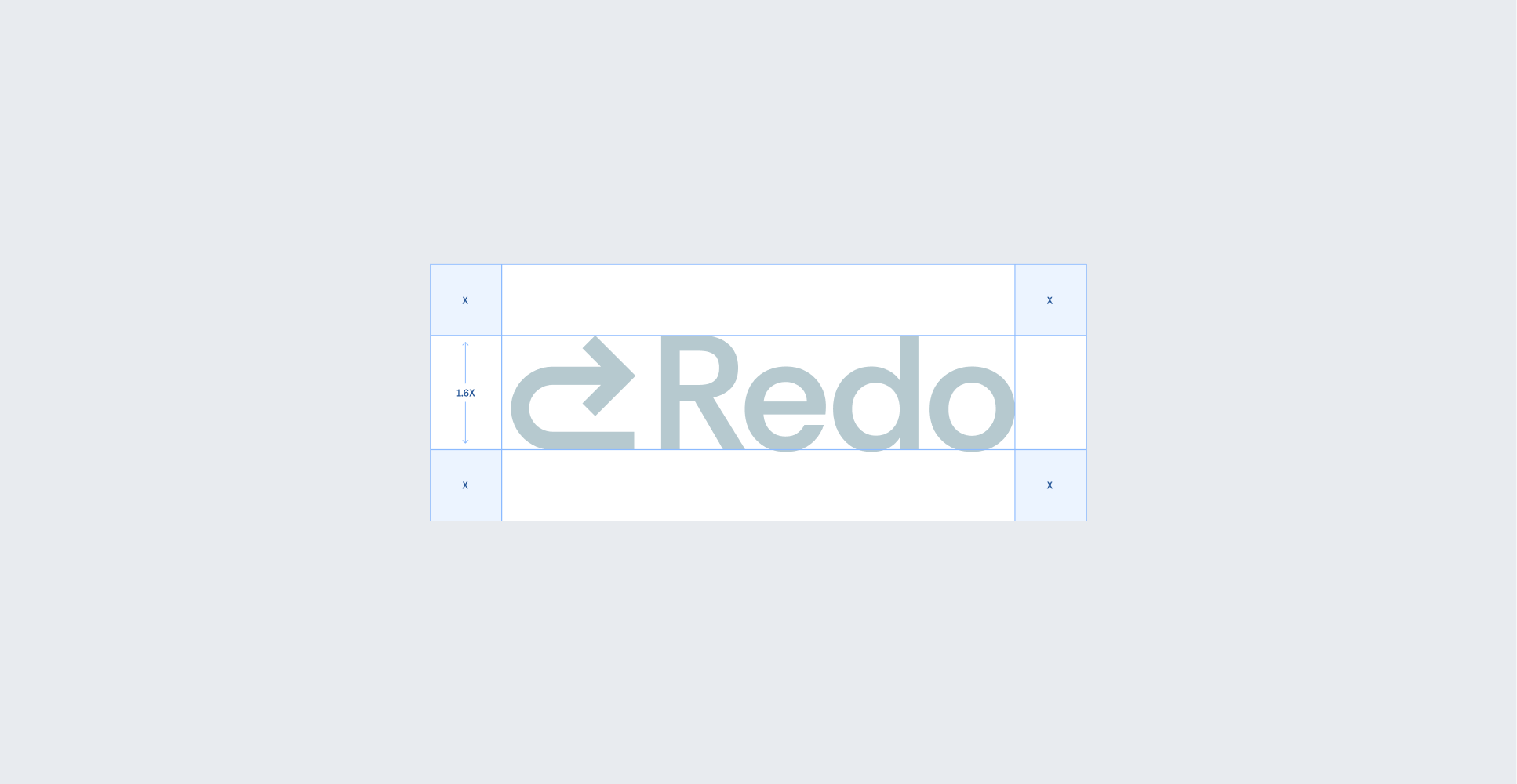
a


3a
9a
9a
3a
3a


9a
9a
3d
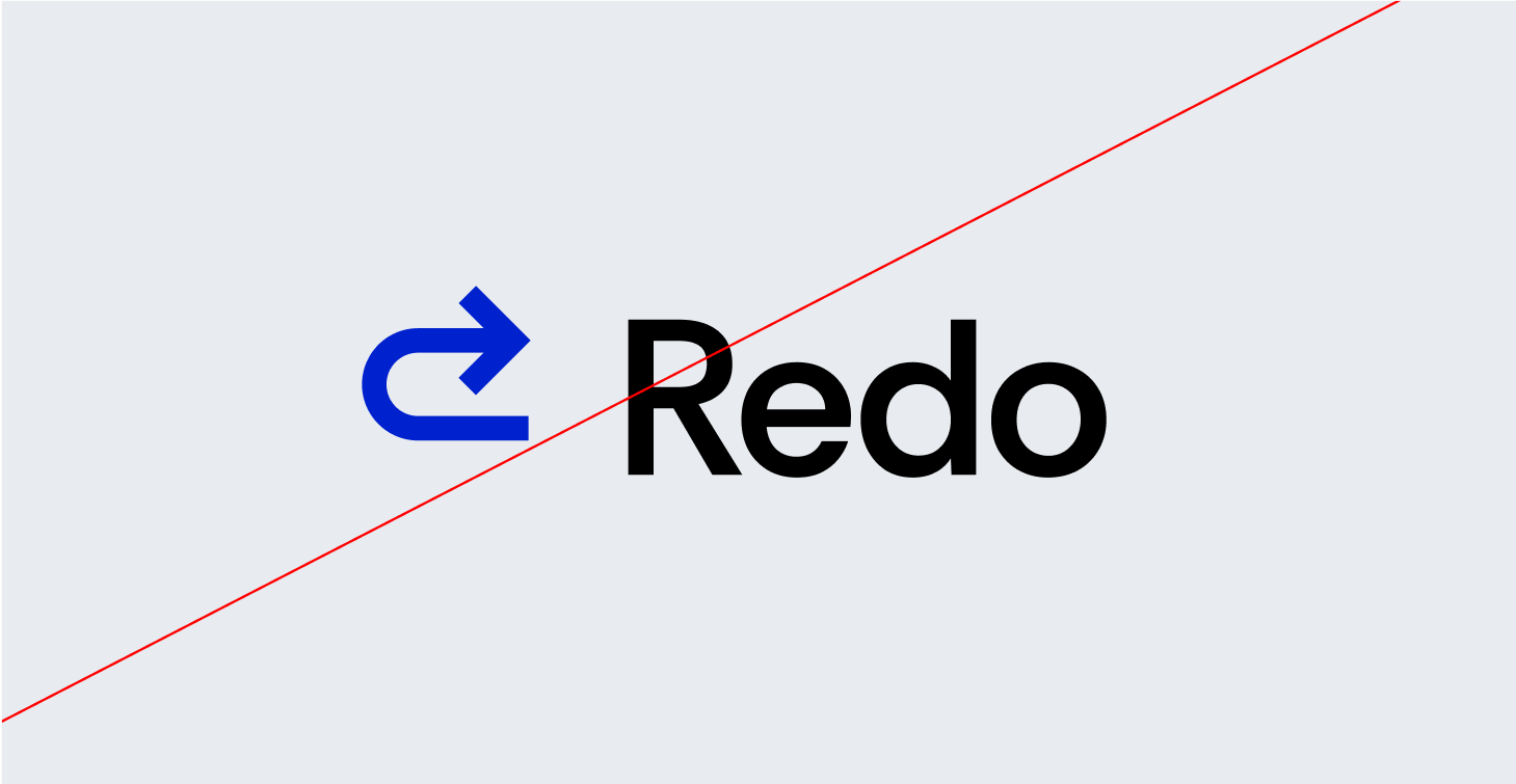
Correct Usage


Do it on white background
Do it on branding colour background

Do it on dark

Black on white

Do it with black on white
3e
Incorrect Usage
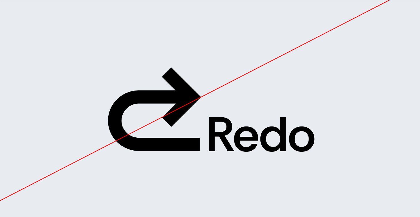


Do not change the alignment
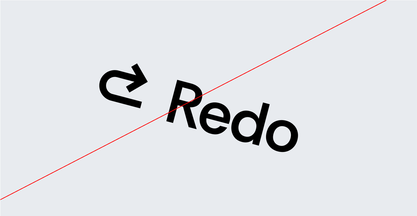


Do not change the graphic logo

Do not change any individual colors

Do not change the color of graphic logo

Do not use the green on white bacground

Do not add gradients the logo
3f
Partnerships


4a
Primary Palette
G400
Hex: #C8F050
CMYK: 25, 0, 100, 0
B900
Hex: #12262B
CMYK: 90, 70, 60, 60
Neutral White
Hex: #FFFFFF
CMYK: 0,0,0,0
4c
Gradient Palette

Gradient 1

Gradient 3


Gradient 4
4d
Color palette


05
Typography
Ptmind’s typography balances clarity and professionalism with a modern yet timeless type pairing, reinforcing our commitment to accuracy, efficiency, and financial stability.
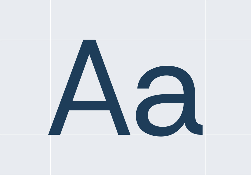
Primary Sans-Serif (Noto Sans) is a clean, modern sans-serif typeface that ensures legibility and precision across all digital and print materials. Its geometric structure reflects clarity, efficiency, and trust, making it the ideal choice for data-heavy content, dashboards, and user interfaces.
Secondary Serif (Noto Serif) is a refined, authoritative serif font that adds a touch of tradition and credibility. Used for emphasis in headlines, reports, and financial documents, it reinforces Ptmind’s expertise and reliability.
This sans-serif and serif combination creates a dynamic contrast—modern yet trustworthy, analytical yet approachable, ensuring Ptmind’s brand communication is always clear, professional, and dependable.
06
Visual
Ptmind’s photography style reinforces our brand’s core values—trust, clarity, and financial empowerment—by showcasing visuals that reflect collaboration, professionalism, and friend .
6a
Pictures
This PTMIND colour palette comes from Ptengine product interface. After extending the colour format, our colour palette matching standard CMYK,RGB and HEX Values for consistency across different media.In some traditional print situtaion the colour should be reproduced in the CMYK format. Equivalent colours can be composed using the RGB and HEX references included when the logo is to used digitally like laptop or mobile.

Character
Characters should smile naturally and brightly, with expressions that avoid being stiff or exaggerated. Characters should be dressed in a simple, clean style with minimal decorative elements.

Group scenes
Characters should smile naturally and brightly, with expressions that avoid being stiff or exaggerated. In group scenes with multiple characters, the overall atmosphere should be relaxed and friendly.


Smileenergy & Casual
Photography should take place in modern, well-lit, and orderly work environments. Emphasis should be placed on clarity, with compositions that avoid visual clutter or excessive dramatizatienvironmentson.
6b
Illustrations
This PTMIND colour palette comes from Ptengine product interface. After extending the colour format, our colour palette matching standard CMYK,RGB and HEX Values for consistency across different media.In some traditional print situtaion the colour should be reproduced in the CMYK format. Equivalent colours can be composed using the RGB and HEX references included when the logo is to used digitally like laptop or mobile.
Light
50%
25%
10%
10%
5%
Dark
50%
25%
15%
5%
5%
G400
Hex: #C8F050
CMYK: 25, 0, 100, 0
B900
Hex: #12262B
CMYK: 90, 70, 60, 60
Primary Variant1
Hex: #1E4830
CMYK: 100, 60, 50, 50(TBD)
Primary Variant2
Hex: #0EB83A
CMYK: 80, 10, 90, 0(TBD)
Neutral White
Hex: #FFFFFF
CMYK: 0,0,0,0


© PTMIND
Legal
Privacy
All Rights Reserved

Download Kit
Contact Us


Brand Guidelines
This guide defines the visual language, design style, and principles that shape a clear and consistent brand experience, no matter the team or area of expertise.
At its core, the core of Ptmind's brand communication lies in precision and a sense of quality, which aligns with the experience our products and services deliver to our customers.This guide lays out the essential design standards that bring our brand to life, from our color system and typography to accessibility benchmarks and documentation.
Whether you're designing for digital platforms or printed materials, these guidelines ensure every touchpoint reflects the trust and efficiency at the heart of Ptmind.
Contents
01
Brand Strategy
02
Personality
03
Logo
04
Color
05
Typography
06
Visual
01
Brand Strategy
Brand Strategy
We embrace the principle of 'win-win' as our guiding philosophy, viewing ourselves as the infrastructure that offers everyone the hope of seeing and becoming a better version of themselves.This process is like planting seeds of hope—and gently nurturing them into small, beautiful moments.”
To define such beauty, it is perhaps this: Be your best self!


Be your best self
02
Personality
Ptmind's brand identity transforms the letters P and T into upward-reaching branches, embodying the fusion of technological strength and human warmth. Unassuming yet resilient, steadfast without assertion—like roots nourishing blossoms, we humbly uplift the growth of those around us. Ptmind willingly serves as the catalyst: never the protagonist, but always the quiet force at your side, journeying with clients and employees through every value leap.


Our Vision:
Why we exist
Our vision is-
Our Mission:
What we do
Our Mission is:
Our Promise:
How we help
Our Promise:
1a
Tone
1b
Voice
03
Logo
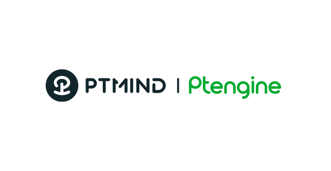
Ptmind's identity is the definitive visual embodiment of our brand ethos. Its graphic element artfully unites the letter P with an inverted T, crystallizing into a delicate floral form. Set against a deep black circular field, this cohesive backdrop intensifies the symbol's expressive power. The wordmark extends this language through maximized rounded corners—radiating approachable warmth while materializing our silent-root philosophy: as steadfast companions nurturing growth, we empower every value leap for clients and employees.
3a
Primary Lockup


3b
Secondary Lockups
3c
Clearspace
a


3a
9a
9a
3a
3a


9a
9a
3d
Correct Usage

Do it on white background
Do it on branding colour background

Do it on dark

Black on white

Do it with black on white
3e
Incorrect Usage

Do not change the alignment

Do not change the graphic logo
Do not change any individual colors

Do not add gradients the logo

Do not use the green on white bacground

Do not change the color of graphic logo
3f
Partnerships


04
Color
PTMIND’s color palette is designed to evoke trust, reliability, and financial clarity, ensuring that every touchpoint reflects our commitment to accuracy and efficiency.
Together, these colors create a strong, dependable, and forward-thinking brand identity, ensuring that Ptmind is instantly recognized as the go-to solution for financial corrections and optimization.
After extending the colour format, our colour palette matching standard CMYK,RGB and HEX Values for consistency across different media.In some traditional print situtaion the colour should be reproduced in the CMYK format. Equivalent colours can be composed using the RGB and HEX references included when the logo is to used digitally like laptop or mobile.
4a
Primary Palette
G400
Hex: #C8F050
CMYK: 25, 0, 100, 0
B900
Hex: #12262B
CMYK: 90, 70, 60, 60
Neutral White
Hex: #FFFFFF
CMYK: 0,0,0,0
4c
Gradient Palette

Gradient 1
Gradient 2

Gradient 3

Gradient 4
4d
Color palette


05
Typography
Ptmind’s typography balances clarity and professionalism with a modern yet timeless type pairing, reinforcing our commitment to accuracy, efficiency, and financial stability.
Primary Sans-Serif (Noto Sans) is a clean, modern sans-serif typeface that ensures legibility and precision across all digital and print materials. Its geometric structure reflects clarity, efficiency, and trust, making it the ideal choice for data-heavy content, dashboards, and user interfaces.
Secondary Serif (Noto Serif) is a refined, authoritative serif font that adds a touch of tradition and credibility. Used for emphasis in headlines, reports, and financial documents, it reinforces Ptmind’s expertise and reliability.
This sans-serif and serif combination creates a dynamic contrast—modern yet trustworthy, analytical yet approachable, ensuring Ptmind’s brand communication is always clear, professional, and dependable.
Ptmind's brand identity transforms the letters P and T into upward-reaching branches, embodying the fusion of technological strength and human warmth. Unassuming yet resilient, steadfast without assertion—like roots nourishing blossoms, we humbly uplift the growth of those around us. Ptmind willingly serves as the catalyst: never the protagonist, but always the quiet force at your side, journeying with clients and employees through every value leap.
Type Sizes 0–24pt/px
130% Leading
0% Tracking
Ptmind willingly serves as the catalyst: never the protagonist, but always the quiet force at your side, journeying with clients and employees through every value leap.
Type Sizes 20–32pt/px
120% Leading
-1% Tracking
Ptmind willingly serves as the catalyst: never the protagonist, but always the quiet force at your side, journeying with clients and employees through every value leap.
Type Sizes 32–50pt/px
110% Leading
-2% Tracking
like roots nourishing blossoms
Type Sizes > 50pt/px
100% Leading
-2% Tracking
5b
Sizing
This PTMIND colour palette comes from Ptengine product interface. After extending the colour format, our colour palette matching standard CMYK,RGB and HEX Values for consistency across different media.In some traditional print situtaion the colour should be reproduced in the CMYK format. Equivalent colours can be composed using the RGB and HEX references included when the logo is to used digitally like laptop or mobile.
06
Visual
Ptmind’s photography style reinforces our brand’s core values—trust, clarity, and financial empowerment—by showcasing visuals that reflect collaboration, professionalism, and friend .
6a
Pictures
This PTMIND colour palette comes from Ptengine product interface. After extending the colour format, our colour palette matching standard CMYK,RGB and HEX Values for consistency across different media.In some traditional print situtaion the colour should be reproduced in the CMYK format. Equivalent colours can be composed using the RGB and HEX references included when the logo is to used digitally like laptop or mobile.
Character
Characters should smile naturally and brightly, with expressions that avoid being stiff or exaggerated. Characters should be dressed in a simple, clean style with minimal decorative elements.
Group scenes
Characters should smile naturally and brightly, with expressions that avoid being stiff or exaggerated. In group scenes with multiple characters, the overall atmosphere should be relaxed and friendly.


Smileenergy & Casual
Photography should take place in modern, well-lit, and orderly work environments. Emphasis should be placed on clarity, with compositions that avoid visual clutter or excessive dramatizatienvironmentson.
6b
Illustrations
This PTMIND colour palette comes from Ptengine product interface. After extending the colour format, our colour palette matching standard CMYK,RGB and HEX Values for consistency across different media.In some traditional print situtaion the colour should be reproduced in the CMYK format. Equivalent colours can be composed using the RGB and HEX references included when the logo is to used digitally like laptop or mobile.
Light
50%
25%
10%
10%
5%
Dark
50%
25%
15%
5%
5%
G400
Hex: #C8F050
CMYK: 25, 0, 100, 0
B900
Hex: #12262B
CMYK: 90, 70, 60, 60
Primary Variant1
Hex: #1E4830
CMYK: 100, 60, 50, 50(TBD)
Primary Variant2
Hex: #0EB83A
CMYK: 80, 10, 90, 0(TBD)
Neutral White
Hex: #FFFFFF
CMYK: 0,0,0,0


© Ptmind
Legal
Privacy
All Rights Reserved
Brand Guidelines
This guide defines the visual language, design style, and principles that shape a clear and consistent brand experience, no matter the team or area of expertise.
At its core, the core of Ptmind's brand communication lies in precision and a sense of quality, which aligns with the experience our products and services deliver to our customers.This guide lays out the essential design standards that bring our brand to life, from our color system and typography to accessibility benchmarks and documentation.
Whether you're designing for digital platforms or printed materials, these guidelines ensure every touchpoint reflects the trust and efficiency at the heart of Ptmind.
Contents
01
Brand Strategy
02
Personality
03
Logo
04
Color
05
Typography
06
Visual
01
Brand Strategy
We embrace the principle of 'win-win' as our guiding philosophy, viewing ourselves as the infrastructure that offers everyone the hope of seeing and becoming a better version of themselves.This process is like planting seeds of hope—and gently nurturing them into small, beautiful moments.”
To define such beauty, it is perhaps this: Be your best self!


Be your best self
02
Personality
Ptmind's brand identity transforms the letters P and T into upward-reaching branches, embodying the fusion of technological strength and human warmth. Unassuming yet resilient, steadfast without assertion—like roots nourishing blossoms, we humbly uplift the growth of those around us. Ptmind willingly serves as the catalyst: never the protagonist, but always the quiet force at your side, journeying with clients and employees through every value leap.


Our Vision:
Why we exist
Our vision is-
Our Mission:
What we do
Our Mission is:
Our Promise:
How we help
Our Promise:
1a
Tone
1b
Voice
03
Logo
Ptmind's identity is the definitive visual embodiment of our brand ethos. Its graphic element artfully unites the letter P with an inverted T, crystallizing into a delicate floral form. Set against a deep black circular field, this cohesive backdrop intensifies the symbol's expressive power. The wordmark extends this language through maximized rounded corners—radiating approachable warmth while materializing our silent-root philosophy: as steadfast companions nurturing growth, we empower every value leap for clients and employees.
3a
Primary Lockup
3b
Secondary Lockups
3c
Clearspace
a
3a
9a
9a
3a
3a
9a
9a
3d
Correct Usage


Do it on white background
Do it on branding colour background

Do it on dark

Black on white

White on black
3e
Incorrect Usage

Do not change the alignment

Do not change the graphic logo

Do not change any individual colors

Do not add gradients the logo

Do not use the green on white bacground

Do not change the color of graphic logo
3f
Partnerships


04
Color
PTMIND’s color palette is designed to evoke trust, reliability, and financial clarity, ensuring that every touchpoint reflects our commitment to accuracy and efficiency.
Together, these colors create a strong, dependable, and forward-thinking brand identity, ensuring that Ptmind is instantly recognized as the go-to solution for financial corrections and optimization.
After extending the colour format, our colour palette matching standard CMYK,RGB and HEX Values for consistency across different media.In some traditional print situtaion the colour should be reproduced in the CMYK format. Equivalent colours can be composed using the RGB and HEX references included when the logo is to used digitally like laptop or mobile.
4a
Primary Palette
G400
Hex: #C8F050
CMYK: 25, 0, 100, 0
B900
Hex: #12262B
CMYK: 90, 70, 60, 60
Neutral White
Hex: #FFFFFF
CMYK: 0,0,0,0
4c
Gradient Palette

Gradient 1
Gradient 2

Gradient 3

Gradient 4
4d
Color palette


05
Typography
Ptmind’s typography balances clarity and professionalism with a modern yet timeless type pairing, reinforcing our commitment to accuracy, efficiency, and financial stability.
Primary Sans-Serif (Noto Sans) is a clean, modern sans-serif typeface that ensures legibility and precision across all digital and print materials. Its geometric structure reflects clarity, efficiency, and trust, making it the ideal choice for data-heavy content, dashboards, and user interfaces.
Secondary Serif (Noto Serif) is a refined, authoritative serif font that adds a touch of tradition and credibility. Used for emphasis in headlines, reports, and financial documents, it reinforces Ptmind’s expertise and reliability.
This sans-serif and serif combination creates a dynamic contrast—modern yet trustworthy, analytical yet approachable, ensuring Ptmind’s brand communication is always clear, professional, and dependable.
5b
Sizing
This PTMIND colour palette comes from Ptengine product interface. After extending the colour format, our colour palette matching standard CMYK,RGB and HEX Values for consistency across different media.In some traditional print situtaion the colour should be reproduced in the CMYK format. Equivalent colours can be composed using the RGB and HEX references included when the logo is to used digitally like laptop or mobile.
like roots nourishing blossoms
Type Sizes > 50pt/px
100% Leading
-2% Tracking
Ptmind willingly serves as the catalyst: never the protagonist, but always the quiet force at your side, journeying with clients and employees through every value leap.
Type Sizes 32–50pt/px
110% Leading
-2% Tracking
Ptmind willingly serves as the catalyst: never the protagonist, but always the quiet force at your side, journeying with clients and employees through every value leap.
Type Sizes 20–32pt/px
120% Leading
-1% Tracking
Ptmind's brand identity transforms the letters P and T into upward-reaching branches, embodying the fusion of technological strength and human warmth. Unassuming yet resilient, steadfast without assertion—like roots nourishing blossoms, we humbly uplift the growth of those around us. Ptmind willingly serves as the catalyst: never the protagonist, but always the quiet force at your side, journeying with clients and employees through every value leap.
Type Sizes 0–24pt/px
130% Leading
0% Tracking
06
Visual
Ptmind’s photography style reinforces our brand’s core values—trust, clarity, and financial empowerment—by showcasing visuals that reflect collaboration, professionalism, and friend .
6a
Pictures
This PTMIND colour palette comes from Ptengine product interface. After extending the colour format, our colour palette matching standard CMYK,RGB and HEX Values for consistency across different media.In some traditional print situtaion the colour should be reproduced in the CMYK format. Equivalent colours can be composed using the RGB and HEX references included when the logo is to used digitally like laptop or mobile.
Character
Characters should smile naturally and brightly, with expressions that avoid being stiff or exaggerated. Characters should be dressed in a simple, clean style with minimal decorative elements.
Group scenes
In group scenes with multiple characters, the overall atmosphere should be relaxed and friendly.


Environments
Photography should take place in modern, well-lit, and orderly work environments. Emphasis should be placed on clarity, with compositions that avoid visual clutter or excessive dramatizatienvironmentson.
6b
Illustrations
This PTMIND colour palette comes from Ptengine product interface. After extending the colour format, our colour palette matching standard CMYK,RGB and HEX Values for consistency across different media.In some traditional print situtaion the colour should be reproduced in the CMYK format. Equivalent colours can be composed using the RGB and HEX references included when the logo is to used digitally like laptop or mobile.
Light
50%
25%
10%
10%
5%
Dark
50%
25%
15%
5%
5%
G400
Hex: #C8F050
CMYK: 25, 0, 100, 0
B900
Hex: #12262B
CMYK: 90, 70, 60, 60
Primary Variant1
Hex: #1E4830
CMYK: 100, 60, 50, 50(TBD)
Primary Variant2
Hex: #0EB83A
CMYK: 80, 10, 90, 0(TBD)
Neutral White
Hex: #FFFFFF
CMYK: 0,0,0,0


© Ptmind
Legal
Privacy
All Rights Reserved